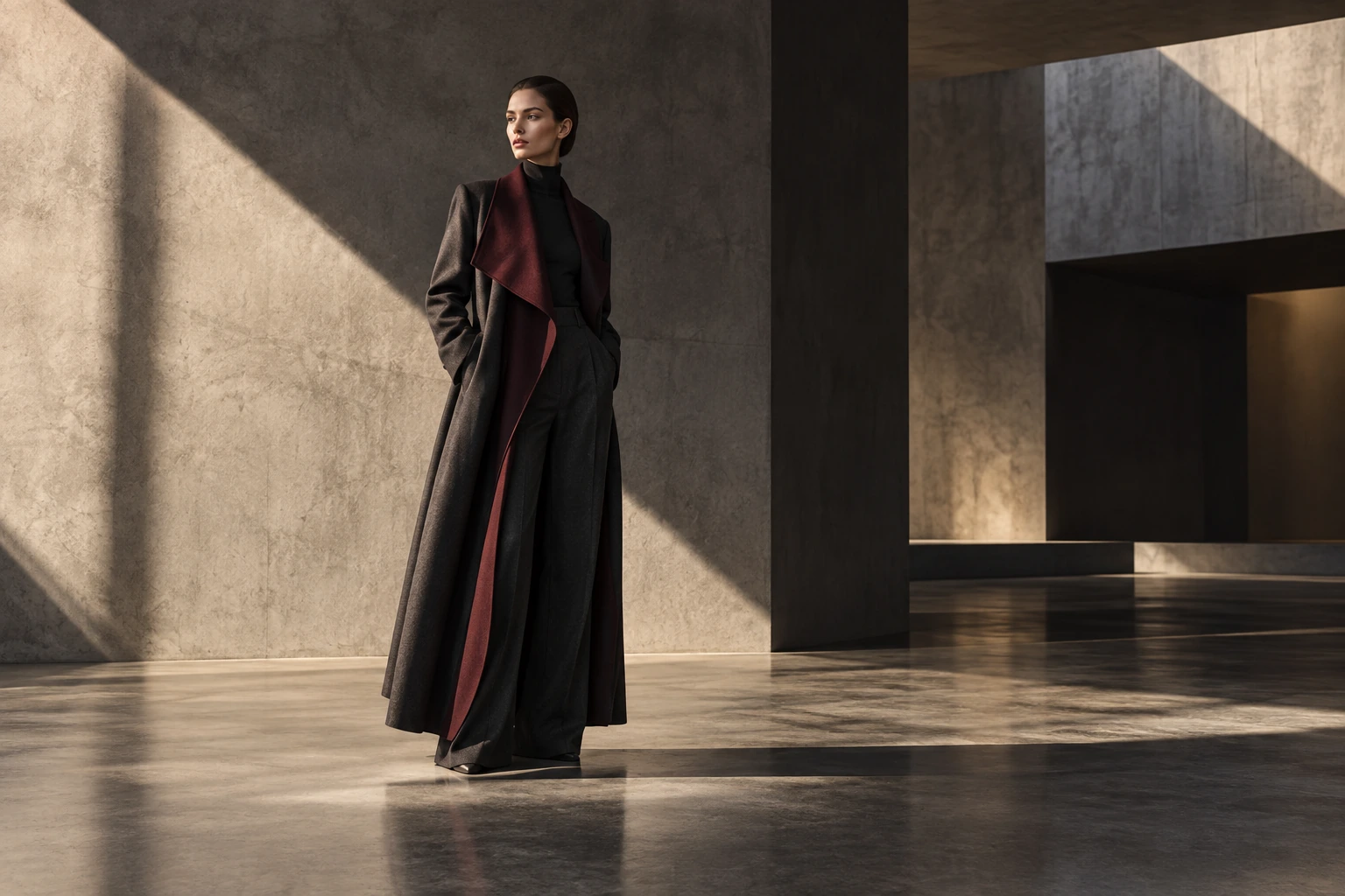
INTERVAL
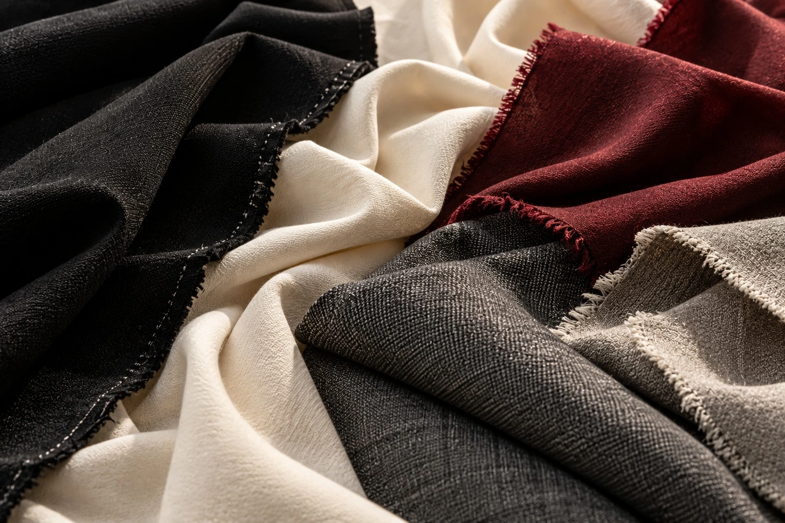
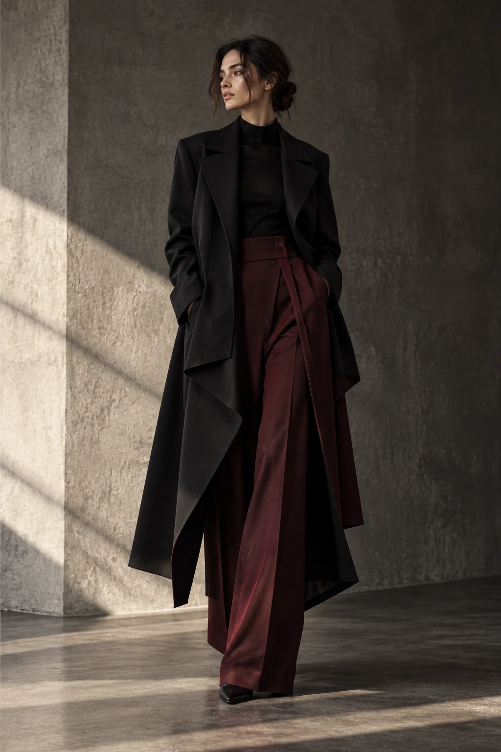
A fashion campaign about distance, movement and controlled interruption. Dark tailoring meets burgundy light.
View ProjectINDEPENDENT FASHION STUDIO
COLLECTIONS / CREATIVE DIRECTION
NOIRÉ / THE COMPONENT LIBRARY
Type. Material. Interaction.
A visual reference for the template.17 CHAPTERS / ATELIER EDITION
01 / TYPOGRAPHY
AFTERIMAGE
A different point of view.
The shape of a question.
Volume held in shadow.
A considered detail.
Cloth becomes a way of seeing.
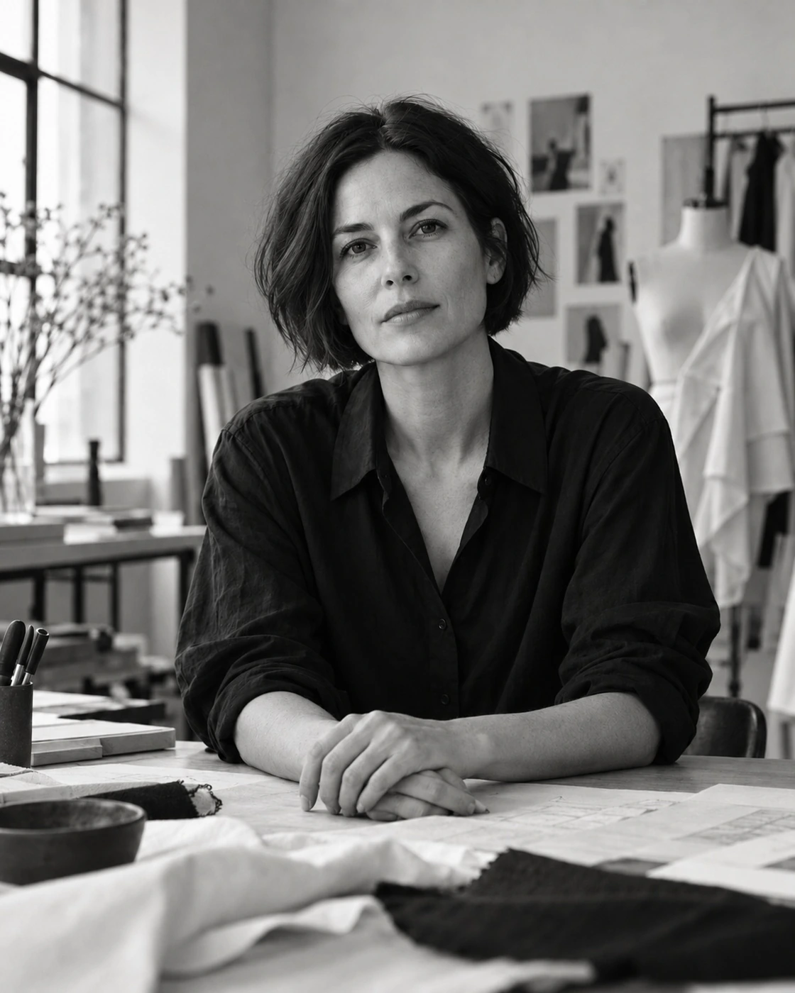
Every garment begins with a conversation between the body and the material.
A studio note, a practical detail.
Look 01 / Milan, 2026
Between movement and stillness.
NOIRÉ / INDEPENDENT FASHION STUDIO
02 / COLORS
#171817Primary text / canvas
#20201fTraining / dark surfaces
#353633Material / media surfaces
#efede6Warm page background
#bcb6adSecondary text on charcoal
#625f58Secondary text on paper
#c4b58eNavigation emphasis
#591d2cCampaign / inquiry accent
#cfccc2Light surface dividers
#8b1023Form validation on paper
#35553ePositive feedback on paper
Values reflect the current template. Flax belongs on dark surfaces; burgundy, error and success text belong on paper. Semantic aliases are defined in main.css.
03 / BUTTONS & LINKS
LIGHT SURFACE
DARK SURFACE
Hover or Tab to test actual interaction states. Example buttons open the service information below.
04 / FORM CONTROLS
Enter a complete email address.
Success — your working format is selected.
05 / CARDS
PROJECT / .project-card
A fashion campaign about distance, movement and controlled interruption. Dark tailoring meets burgundy light.
View ProjectCOLLECTION / .collection-stage
Autumn / Winter 2026
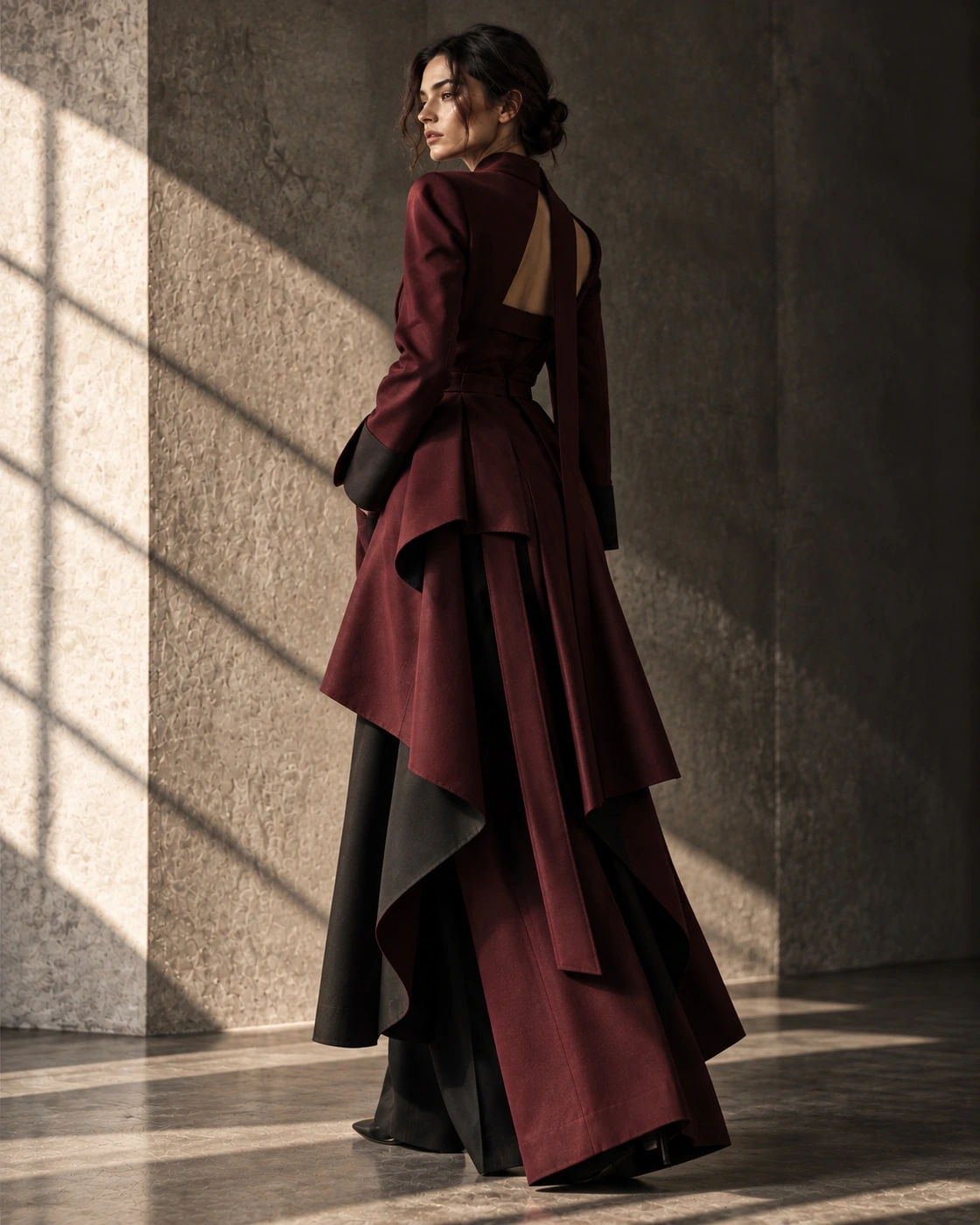
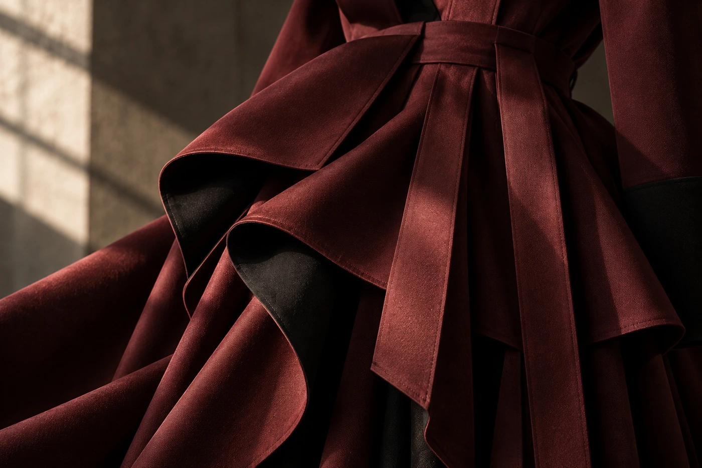
Volume held in shadow. Black wool, folded surfaces and restrained interruption.
EXPLORE COLLECTION06 / ACCORDION
Share the intended wearer, purpose and starting point. The studio defines a working brief with you.
A question and your current experience. Materials and preparation are agreed before the session.
The format follows the work. Concept reviews can be remote; fittings require a considered physical arrangement.
07 / TABS
Controlled volume allows the garment to interrupt the outline without losing its relationship to the wearer.
A raised shoulder, a restrained closure and a folded hem establish the silhouette.
A dense cloth holds the plane; soft lining keeps the structure close to the body.
08 / TABLES
| Element | Material | Construction | Purpose |
|---|---|---|---|
| Body | Black wool | Folded panel | Hold volume |
| Lining | Cupro | Floating seam | Allow movement |
| Closure | Covered fastening | Concealed placket | Restrain interruption |
| Hem | Self fabric | Deep facing | Maintain weight |
09 / GALLERY
10 / LIGHTBOX
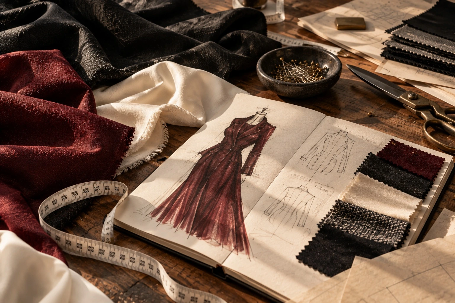
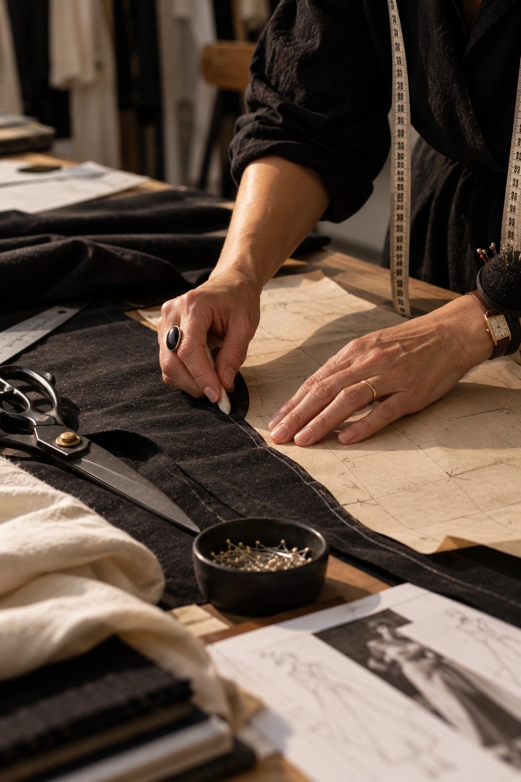
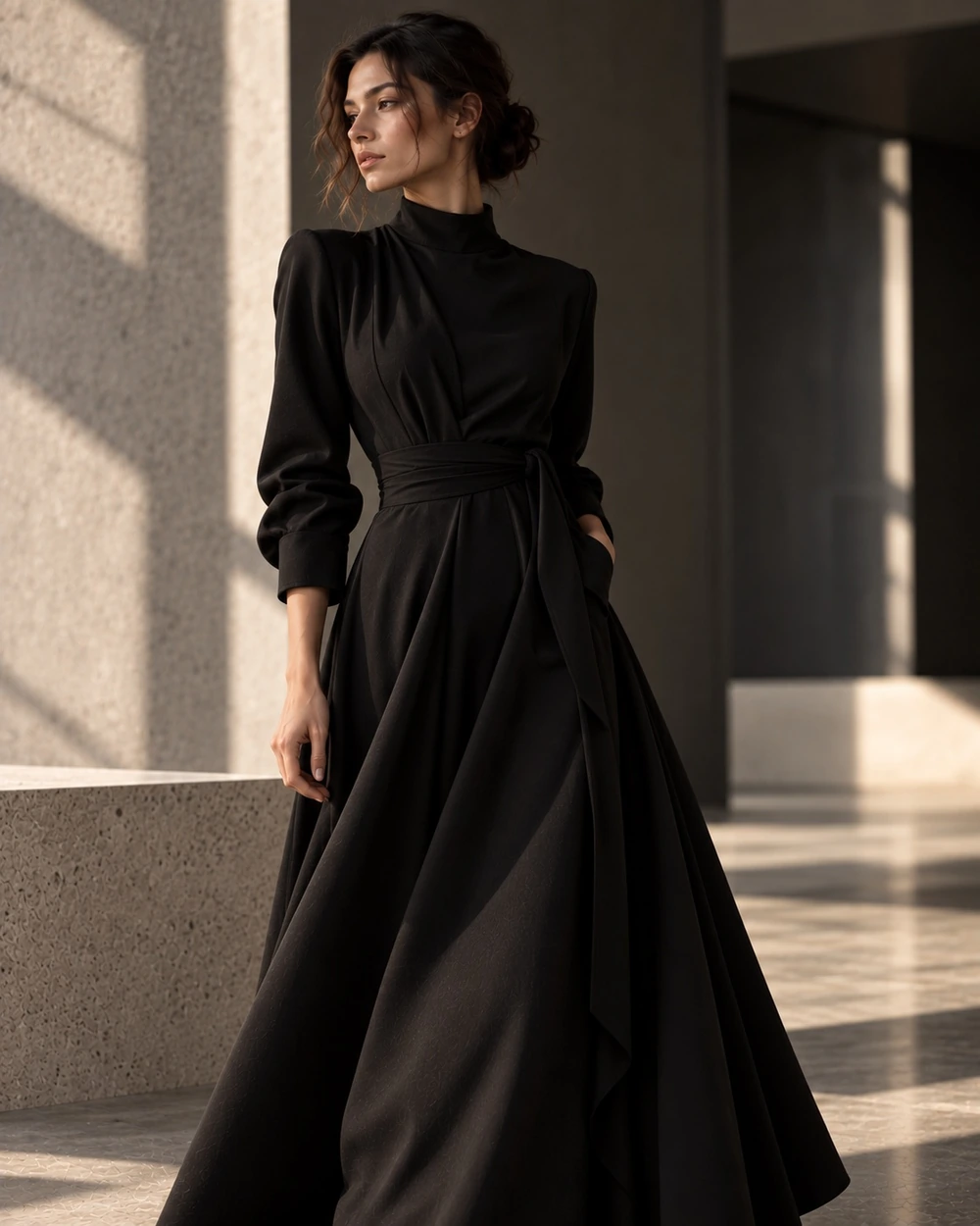
The garment.
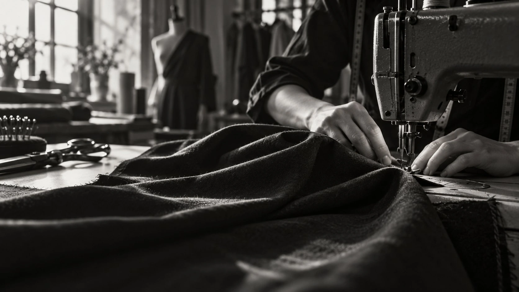
The material.
The detail.
Open any gallery image above. A native dialog keeps focus inside the viewer and returns it to the image when closed.
← / → Browse · Escape Close · 01 / 03 Counter
11 / MEDIA
12 / TAGS & METADATA
MILAN / AUTUMN — WINTER 2026
13 / PAGINATION
Page 1 of 3
15 / FEEDBACK STATES
FORM ERROR
Please enter a complete email address.
FORM SUCCESS
Draft validated. This demonstration does not send messages.
Preparing the image study…
16 / MOTION & INTERACTION
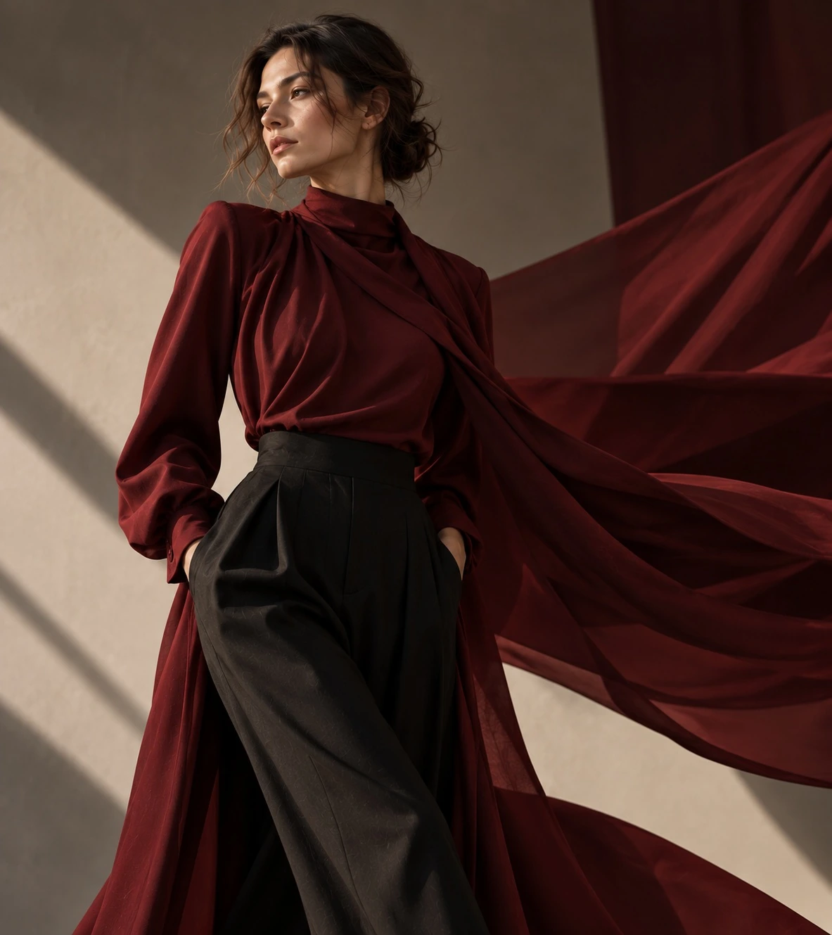
IMAGE / CARD HOVER
.media-link / --ease-enter
Card interactions are demonstrated in 05.
MASK REVEAL
180ms fast / 350ms normal / 650ms slow. With prefers-reduced-motion, transitions and reveals become immediate. No scroll interception.
17 / LAYOUT / GRID
EDITORIAL / 2 COLUMNS
EDITORIAL / 3 COLUMNS
MOBILE / 4 COLUMNS
TABLET / 8 COLUMNS
DESKTOP / 12 COLUMNS
8px16px24px32px48px64px.wrap / max-width 105rem. Margins: 2.5rem desktop, 1.25rem below 640px. Flexible columns use minmax(0, 1fr).